THOR
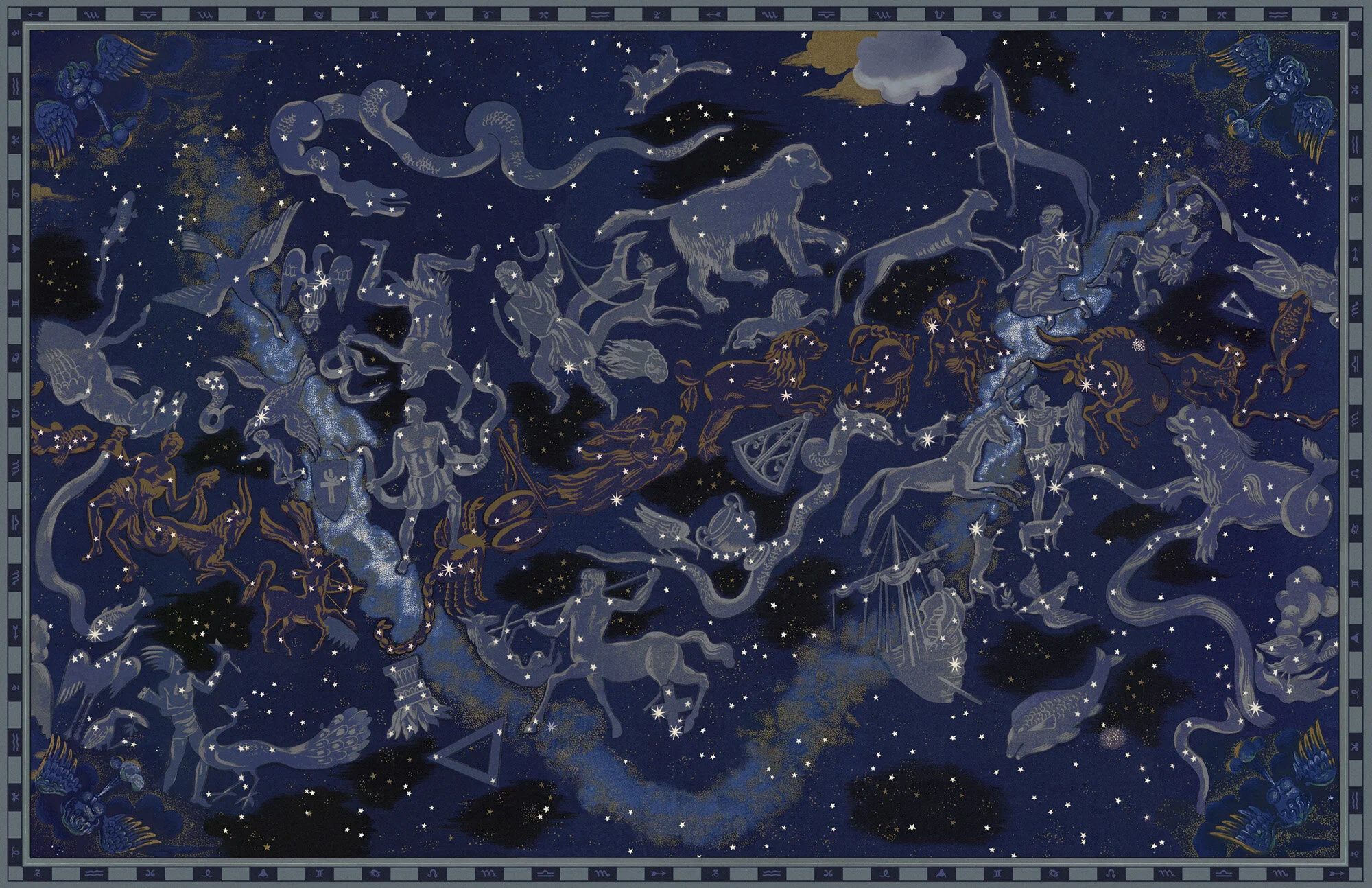
So much gold! So many patterns! For one of my favorite sets, Heimdall’s Observatory, I was tasked with creating the textures that would adorn the overlapping wheels designed by Jeff Markwith. The detail ended up being so intricate that we broke a router at one of the set shops (sorry guys!). Once cut, the segments had to be cast, painted and aged. It was a lengthy process but one which really paid off. Another rewarding project was designing a set of massive golden doors for the Throne Room. Between those and a few other pieces, I was worried the sculptors would be coming for my head by the end of the show. Apparently it was the opposite because everyone was kept busy!

HOTEL ARTEMIS
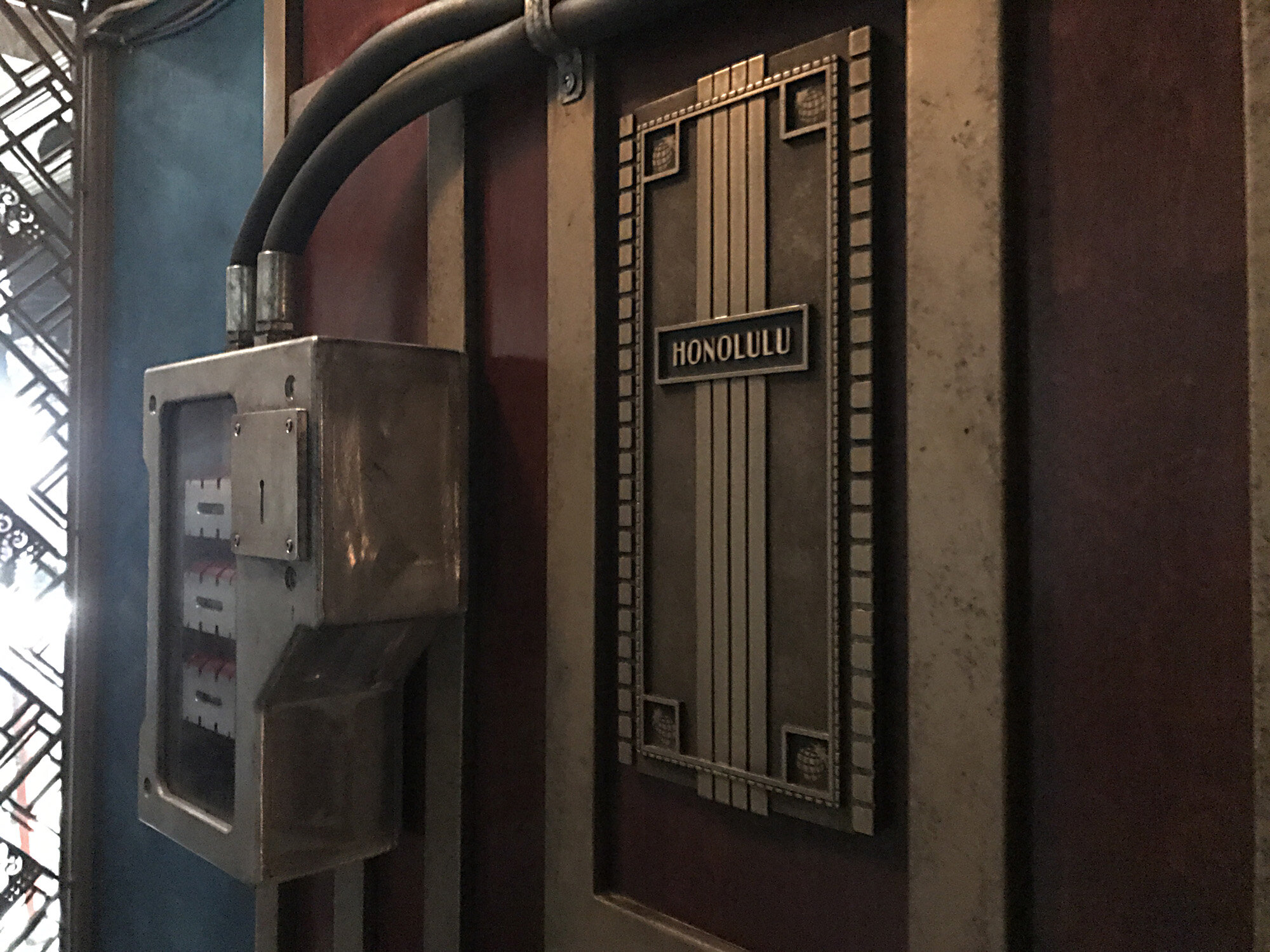
OK, not quite science fiction but it’s a tricky one to place! Hotel Artemis is set in the near future (2028) in downtown Los Angeles. A limited budget inspired creative methods to make our hotel set look more expansive than it was. I designed Deco-inspired screens for the entrances of each room which had interchangeable panels. We swapped them out when we had to changeover to a different room. We did something similar with the bathroom tile motif. Our director, Drew Pearce, was heavily involved with many of the design details, especially the graphics. The Hotel Artemis logo we developed figured prominently throughout the set and beyond into marketing. We also developed a graffiti stencil which was used at every opportunity for the exteriors. It was a very collaborative, tight-knit indie project and remains one of my favorite art departments to have worked within.

MEN IN BLACK 3
Pre-production started in Los Angeles but moved to New York, so I was involved in a good chunk, though none of the flashback portion. I think Wu’s is my favorite neon sign ever, and was happy to see that my comp came very close to approximating the final effect (still from the film below). I also developed a pattern for the linoleum (never too much pattern) and some of the storefront signs in the vicinity. Another fun project was working out the color scheme for the bowling alley with production designer Bo Welch.

MINORITY REPORT
We had the rare luxury of time and used it for an abundance of research and development. The Precrime logo was the most important graphic element of the movie, as it incorporated the unique shape of the precog tank and was used on nearly every element associated with the Precrime organization. Concerning type, we wanted to steer clear of the ubiquity of Microgamma, Eurostile and similar typefaces, feeling they would look cold and dated in our 2054 world. Precrime was a formidable organization striving for acceptance on a national level, therefore we felt they needed a public brand that was warm and approachable. We commissioned a custom typeface from Jens Gehlhaar to be used exclusively for it. Sans, semi-serif and serif versions were developed in three weights and used on everything from screen graphics to the names etched into the wooden victim and murderer balls. The mall seen in the film was quite a challenge largely for the square footage we had to address. It was an opportunity to play with some amazing new technologies and work with an impressive number of brands who were game to project themselves decades into the future.


