OCEANIC AIRLINES (LOST)
Oceanic used to be a nice, default airline name to use when clearance couldn’t be obtained for a real one. I worked on the pilot and everyone in the art department assumed the logo would be seen on the crashed plane and related ephemera and that would be it. Little did we know! It delighted us to no end that we had managed to create one of many hotly debated puzzle pieces and one that was used for the duration of the show. Needless to say, it’s still nearly impossible to link Oceanic Airlines with anything other than Lost and flight 815.
STARK INDUSTRIES (IRON MAN)
I think if we’d known at the beginning how long this logo would be used (2007-present), we would’ve freaked ourselves out. We started out placing it on buildings, weapons, badges, vehicles and paperwork. It has appeared in many more applications since then, and in many more shows, with its most recent appearance (that I know of) in Wandavision. You can even find it at Disneyland. RIP Tony Stark and our fearless captain, Michael Riva.
From Iron Man (2007)…
…to Wandavision (2021)
ENDER’S GAME
Well before production started, a small design team was assembled to work with the director, Gavin Hood, on developing several principal elements for the film. My role was to create a logo that would be used on a concept poster. I also began work on several of the team identities which would be applied to costumes and signage. Given how early it was in the process, I was surprised several years later when the marketing campaign rolled out and I saw that the logo had stuck.

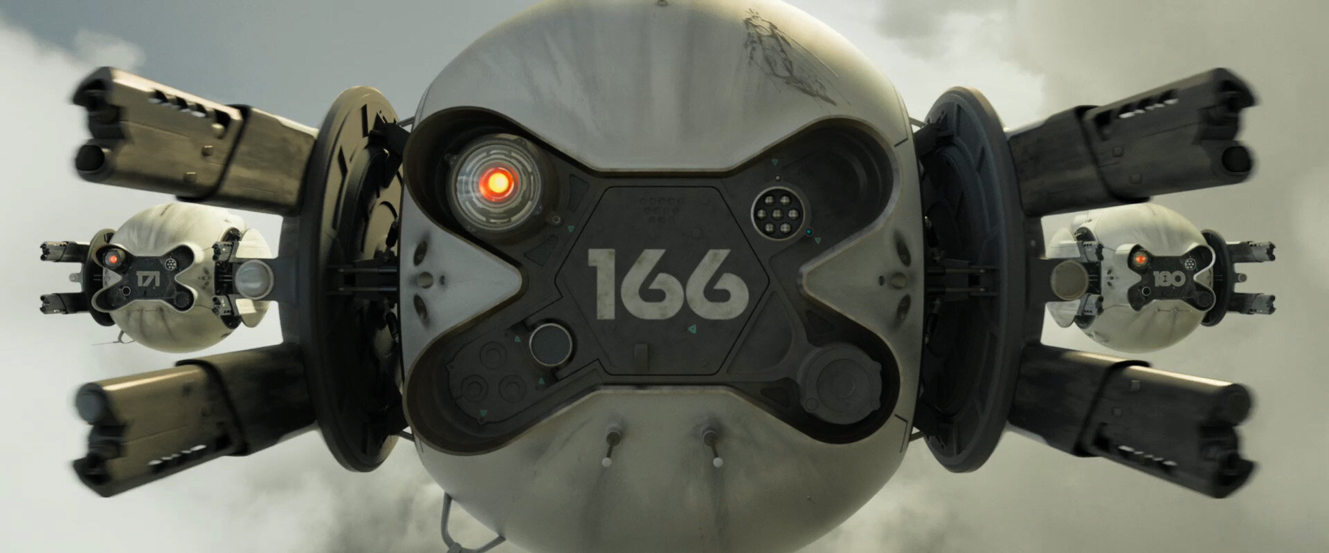
OBLIVION
Oblivion provided another opportunity to rethink typography in the future. In this case, most text the audience would see would have been generated by an alien race striving for a convincing facsimile of human technology. Doubtless they would have found the usage of numerous type styles baffling and inefficient. Would they be unable to resist applying some overlay of their own civilization? Might some of our letterforms have been misconstrued? I searched for a font that would complement the clean, compelling designs Darren Gilford and the rest of the art department were developing, but came up short and realized we should create our own. To provide a simple “alien” overlay, I developed a set of symbols representing fifteen of the most common bigrams in the English language. Once the initial drawings were completed, I forwarded them to noted typographer Jens Gehlhaar, who refined them and created a set of four weights which could address all the needs the production might have, particularly for vehicle markings and motion graphics. The resulting font set was called DC Tet.


